
Techniques for Shading and Blending
Techniques for Shading and Blending: Breathe Life into Your Artwork
Shading and blending are the cornerstones of coloring excellence, transforming flat images into vibrant worlds with depth and dimension. Mastering these techniques will empower you to elevate your skills and create truly awe-inspiring artwork. This chapter delves into the secrets of shading and blending, equipping you to take your coloring to the next level.
The Art of Cross-Hatching:
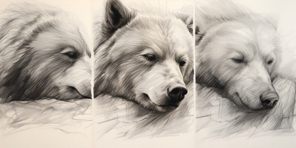
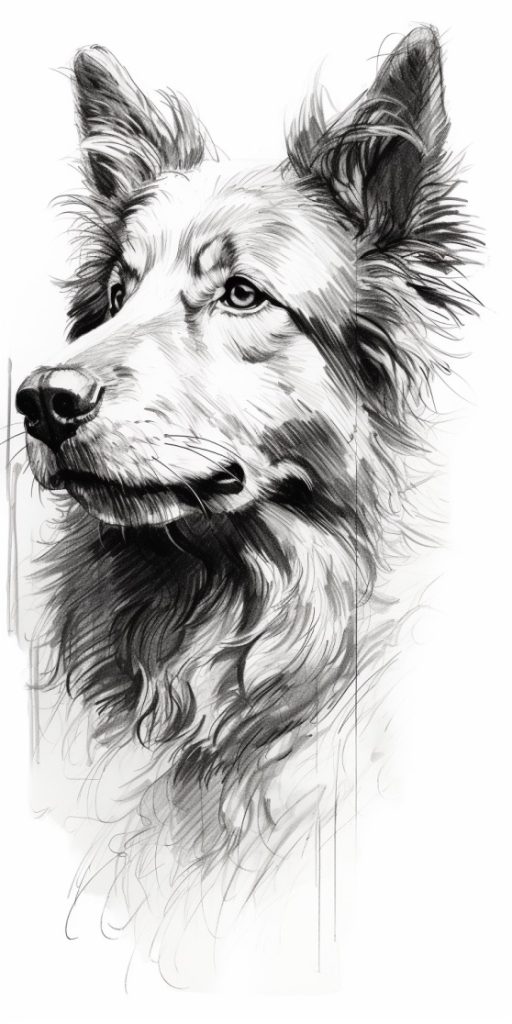
Cross-hatching involves layering sets of parallel lines in different directions, creating intricate textures and nuanced values. Experiment with varying angles and line spacing to achieve diverse effects. Denser lines cast deeper shadows,while lighter strokes generate soft highlights, adding a sense of depth and realism. This technique can also depict movement or textures like fur and fabric, breathing life into your creations.
Layering for Richness and Depth:
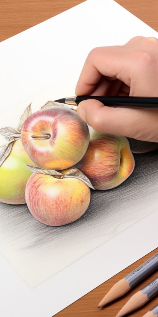
Layering is the foundation of effective shading and blending. Build upon a base color, gradually adding multiple layers with increasing pressure. This allows for smooth transitions and captivating gradients. Consider the opacity and transparency of your chosen colors to achieve the desired effect. Light colors layered over dark ones create radiant highlights, and vice versa. Unleash your creativity by experimenting with diverse color combinations and witness the emergence of unique and mesmerizing effects.
Burnishing: Polishing Your Masterpiece:
Burnishing involves using a white or light-colored pencil to smoothen and blend colors on the paper. Apply heavy pressure with the white pencil over colored areas, gently pushing the pigments together for a seamless blend. This technique lends a polished and professional touch to your artwork. Alternatively, colorless blender pencils or blending stumps offer similar effects. These tools help spread and layer the colors, resulting in a more blended and painterly appearance. However, be mindful of the paper you’re using, as burnishing can create a glossy or waxy finish, not always ideal for every project.
Beyond Pencils: Embracing Blending Tools:
Expand your horizons by venturing beyond burnishing to explore dedicated blending tools like stumps, tortillons, or even cotton swabs. These tools help spread and soften the colors, adding a painterly flair to your artwork. Dip the blending tool lightly into a compatible solvent, like odorless mineral spirits or blending solution, and gently blend the colors together.Experiment with different tools to discover your perfect match. Remember to clean them regularly to avoid muddying the colors.
Gradient Bliss: Seamless Color Transitions:
Gradient blending seamlessly transitions between colors, creating mesmerizing effects. Start with the lightest hue and gradually incorporate the darker ones, layering and blending them using either the layering or burnishing technique. This technique evokes depth and dimension within your artwork. Utilize a color chart or wheel to choose harmoniously blending colors and create captivating gradients. Remember, exploring the full range of values within a color family adds a touch of realism and depth.
Unlocking the Secrets of Color Pencils:
Color pencils offer a treasure trove of shading and blending techniques. Utilize stippling (creating dots), scumbling (small circular motions), or hatching (parallel lines) to achieve diverse textures and effects. Combine these techniques with layering and blending tools for ultimate versatility. For an even more painterly look, experiment with solvents or odorless mineral spirits to dissolve the pigments. However, always prioritize proper ventilation when using solvents due to potential toxicity.
Mastering Light and Shadow:
Realistic shading and blending hinge on understanding the interplay of light and shadow. Identify the direction and intensity of the light source in your artwork. Shadows usually form opposite the light, while highlights appear on the illuminated side. Observe the variations in value, from the darkest shadows to the brightest highlights, and translate this knowledge into your shading and blending. Studying real-life objects and photographs can refine your understanding of light and shadow. Experiment with various lighting setups in your drawings to explore their impact on your shading techniques.
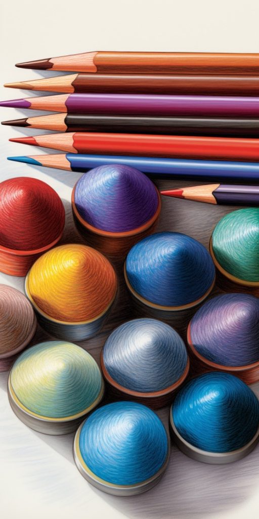
The Power of Color Theory:
Color theory holds the key to effective shading and blending. The chosen colors and their interactions significantly influence the realism and cohesiveness of your artwork. Familiarize yourself with the color wheel and how colors relate to one another. Complementary colors (opposite each other on the wheel) can create dynamic contrasts and draw attention to specific areas. Conversely, analogous colors (neighbors on the wheel) blend harmoniously and facilitate smooth transitions. Explore different color schemes and experiment with warm or cool hues for shading and blending to evoke specific moods or atmospheres in your artwork.
Texture and Surface Considerations:
Different surfaces and textures demand unique shading and blending techniques. Smooth papers facilitate smoother blends and finer details, while textured papers can add a tactile and intriguing element to your artwork. Experiment with applying varying pressures and strokes to accommodate the paper’s texture. Similarly, adjust your technique for shading and blending on surfaces like canvas, wood, or fabric. Be mindful of how the chosen surface impacts the overall appearance of your colored artwork.
Remember, practice is key! Take your time to experiment with various shading and blending techniques to discover those that align with your style and desired effect. Don’t shy away from making mistakes; learn from them. The more you practice, the more adept you’ll become at shading and blending, elevating your coloring to new levels of creativity and expression. Embrace the joy of exploration and savor the journey of mastering these techniques.
Remember – Practice Is Key!
and enjoying the process 🙂