
Choosing Colors and Color Harmony
Choosing Colors with Harmony: Unveiling the Magic of Your Palette
When it comes to coloring, few aspects hold greater importance than choosing the right colors and crafting a harmonious palette. The hues you select can profoundly impact the overall perception and emotional response to your artwork. Understanding color harmony unlocks the keys to achieving your desired effect, whether you’re aiming for vibrant energy or calming serenity.
Unveiling the Color Wheel: Your Guide to Chromatic Relationships
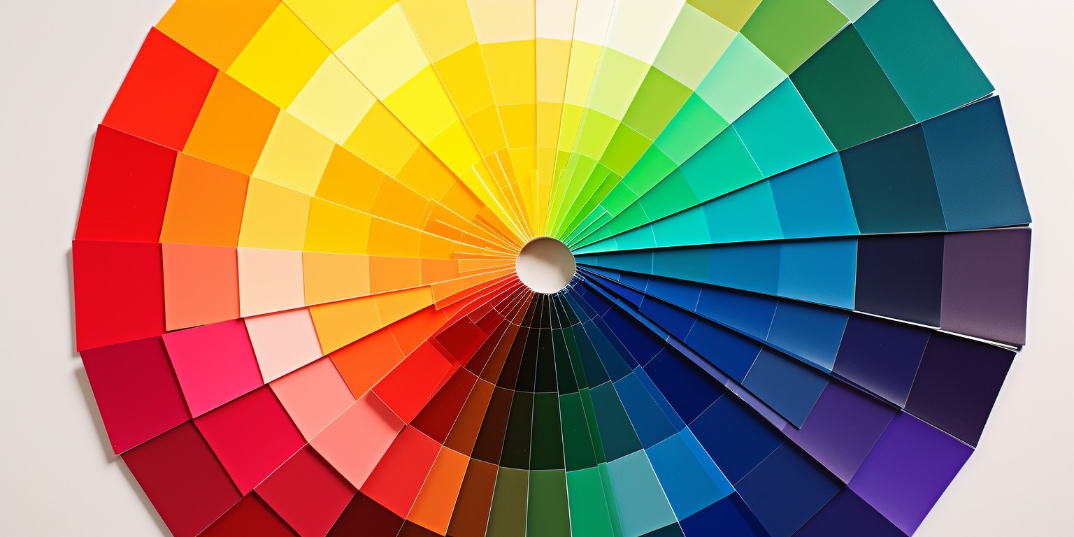
The color wheel serves as a fundamental tool for comprehending color relationships. It showcases primary colors (red,blue, and yellow), secondary colors (orange, green, and purple), and tertiary colors (blends of primary and adjacent secondary colors). By examining the wheel, you can identify various color connections, such as complementary, split-complementary, analogous, and many more.
Complementary Colors: A Striking Dance of Contrast
Complementary colors reside directly opposite each other on the color wheel. When paired together, they create a high-contrast dance that makes each color stand out vibrantly. For instance, red and green, blue and orange, or yellow and purple are classic examples. Harnessing complementary colors can infuse your artwork with visual intensity and impact. However, their strong contrast demands balance, as overusing them can feel overwhelming.
Analogous Colors: A Symphony of Cohesion
Analogous colors are neighbors on the color wheel, sharing a similar hue. This inherent kinship allows them to create a harmonious and cohesive look when used together. Think blue-green, green, and yellow-green as prime examples.Utilizing analogous colors fosters a sense of unity and balance in your artwork, often found in serene nature scenes or pieces aiming for a soothing atmosphere.
Split-Complementary Colors: Bridging the Gap
Split-complementary colors offer a nuanced twist on the concept of complements. Instead of using the direct opposite,you choose the colors adjacent to it. This approach delivers a more balanced and less contrasting color combination. For instance, instead of pairing red with green, you can use red with blue-green and yellow-green for a more subtle effect. Split-complementary colors provide a middle ground between the intensity of complementary colors and the cohesiveness of analogous ones.
Triadic Colors: A Vibrant Explosion of Energy
Triadic colors are evenly spaced around the color wheel, forming a triangle. Incorporating them into your artwork can result in a vibrant and dynamic color scheme. Imagine the liveliness and energy infused by using red, blue, and yellow together. Triadic color schemes provide a visually striking palette that captures attention and adds a playful touch to your artwork.
Warmth and Coolness: The Temperature of Emotion
Colors possess inherent temperatures, evoking distinct emotional responses. Warm colors like red, orange, and yellow tend to radiate energy, warmth, and vibrancy. In contrast, cool colors such as blue, green, and purple whisper of calmness and serenity. Utilizing contrasting warm and cool colors can add depth and complexity to your coloring by creating a visual juxtaposition that sparks interest and engages the viewer.
Mind the Mood: Coloring Your Emotions
When selecting colors for your artwork, considering the mood or emotion you wish to convey is crucial. Are you aiming for a peaceful and relaxing image? Opt for cool and muted colors, as they can establish a tranquil ambiance. Shades of blue, green, and purple are often associated with serenity and introspection. Conversely, if you intend to depict excitement and energy, consider incorporating vibrant and contrasting colors like reds, oranges, and yellows to evoke a sense of dynamism. Understanding the emotional impact of colors empowers you to effectively transmit your desired message or atmosphere.
Experimentation: The Playground of Creativity
While understanding color harmony is valuable, remember that art thrives on exploration. Encourage yourself to experiment with different color combinations and techniques. Sometimes, unexpected choices can lead to captivating and original results that set your artwork apart. Embrace the joy of discovery and let your creativity flow freely! Allow yourself the freedom to find unique combinations that resonate with you and the emotions you want to evoke in your audience.
By expanding your knowledge of color harmony and exploring diverse color combinations, you can elevate your coloring game and create captivating artworks that resonate with viewers. Ultimately, the use of color should serve as a tool for enhancing your artistic expression and storytelling. So, grab your coloring tools, unleash your imagination, and embark on a colorful journey of artistic self-discovery!
Next – Coloring Different Types of Images